


Work
Identity system for a leather goods and ready-to-wear house

The category
Luxury fashion identity has converged. Over the last decade nearly every European house redrew its wordmark as a geometric sans in capitals, evenly spaced, black on white. Reasonable arguments existed (screen legibility, app icons, a global audience) and the result is a category where a dozen houses are typographically indistinguishable at small sizes.
Which leaves an unusual opening: the way to look different in luxury fashion right now is to not be a geometric sans.
The second convergence is rhythmic. Two seasons became six drops. Campaign machinery runs continuously, and an identity system built for that churn has to be endlessly flexible, which usually means it holds no position at all, because a system that can accommodate anything asserts nothing.
The position
One house. No seasons. Collections are numbered, not named.
Elena Marchetti does not run a seasonal calendar. It maintains a permanent collection, refined annually, with numbered releases rather than named ones. Nothing is discontinued to create urgency. A bag bought in year one is still made in year six.
This is a real position in fashion, held by houses that trade on permanence rather than novelty, and it is a gift to an identity system: the identity does not have to flex for a new story four times a year, so it can be built to hold.

The wordmark and monogram
The wordmark is set in a high-contrast transitional serif, upper and lower case, with no letterspacing: a rejection of the category on every count. Serif, against the category's geometric sans, because the position is permanence and a serif carries time in its construction. Upper and lower case, against the category's all-caps, because caps shout and flatten; a name set as a name reads as a person rather than a logo. No letterspacing, because the tracked-out capital is the single most exhausted gesture in luxury branding.
The monogram is an EM ligature, drawn once and used sparingly rather than tiled into a repeat pattern: a monogram pattern is how a house signals itself to people who need to be seen carrying it, and this house's position is the opposite of that. It appears at three sizes only: blind-debossed on leather goods, foil-blocked on packaging, and as the digital avatar. Nowhere else.
Colour and typography
Two neutrals and one colour. Bone, a warm off-white, the cream already present in the photography. Ink, a near-black with warmth in it, never pure black. Oxblood, the burgundy already present in the leather goods, the only saturated colour the house owns, used at product scale rather than graphic scale. It appears on bags, on linings, on a box ribbon. It does not appear as a background, a button or a banner, which is the discipline that makes it a house colour rather than a brand colour: it lives in the product, so seeing it anywhere means seeing the product.
Beyond the wordmark, a neutral grotesque carries product descriptions, specification, ecommerce and care instructions: the serif carries the house, the grotesque carries the information. Numerals matter more than usual on a house that numbers its collections: old-style figures in editorial, tabular figures in specification.
Art direction, packaging and digital
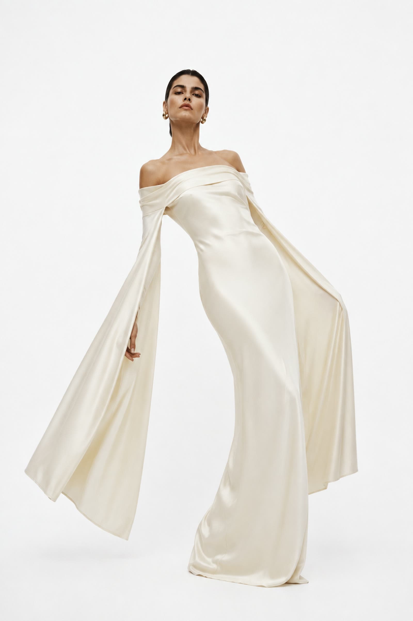
The existing photography establishes the register (single figure, controlled light, hard shadow, neutral ground, one saturated object) and it is codified as rules so it survives the next photographer: one subject, natural directional light with a defined shadow edge, a neutral ground, the product carrying the only colour in frame, full-length or three-quarter framing, and structural negative space. Any competent photographer can shoot to them and the results will look like the same house.
Packaging is a rigid box in bone board, blind-debossed monogram, oxblood ribbon: no printed graphics, no interior tissue print, no founder's letter. The one printed item inside is a specification card: the product, the material, the maker, the collection number, the year, set as a record rather than a piece of persuasion.
The website is a catalogue, not a campaign: product photography at scale, minimal chrome, no carousel, no countdown. Every collection number since the first remains browsable with its full specification, because a house arguing for permanence has to be able to prove it.

What this doesn't do
No tracked-out capitals, and no monogram pattern: both are the exact category convention this identity is built to reject. No seasonal campaign naming (no "Resort 26", no "Pre-Fall") because the house does not have seasons. And no founder mythology: the name is a name, and a fictional biography is the exact thing that would turn a labelled concept into a fabricated one.
We don't publish client results. The ones worth publishing belong to the client.